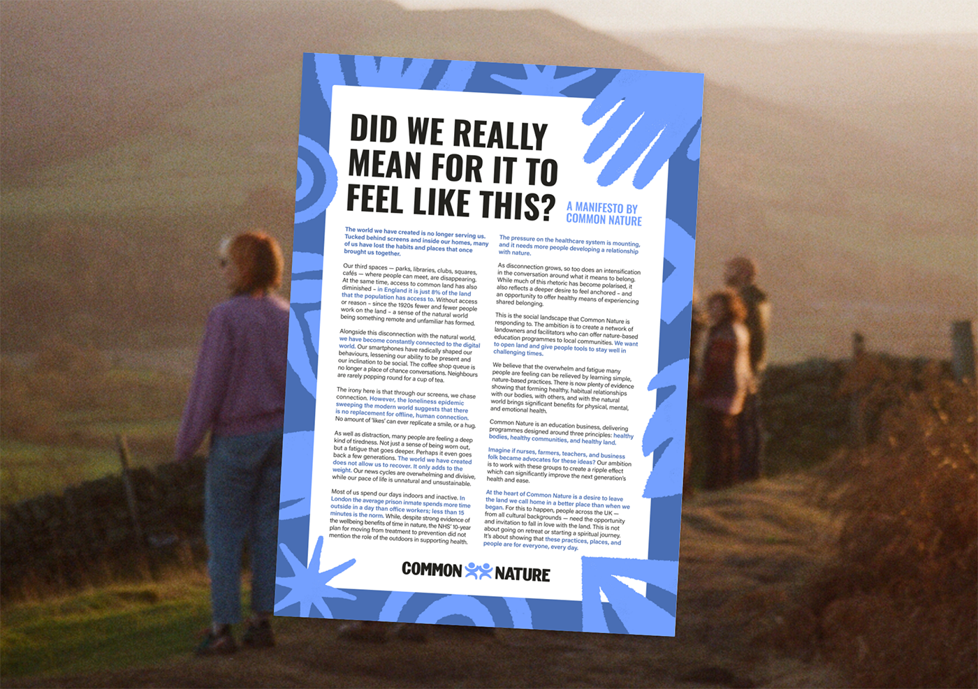
Common Nature connects landowners, facilitators and local communities through nature-based education programmes, helping people build healthier relationships with themselves, each other and the natural world.
The aim was to create a brand that felt welcoming, energetic and accessible, moving away from the expected visual language of wellness and outdoor brands.
Taking inspiration from British public communication systems, including historic posters and noticeboards, the typography brings a sense of familiarity and confidence to the identity. Designed to communicate quickly and clearly to a wide audience, it reflects the brand’s ambition to make nature accessible to all.
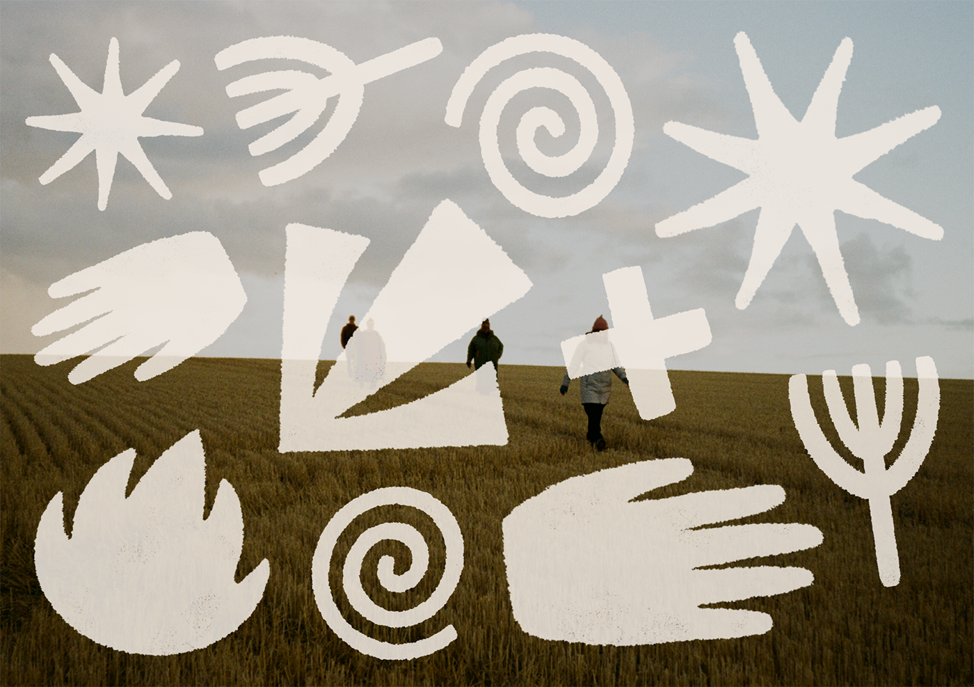
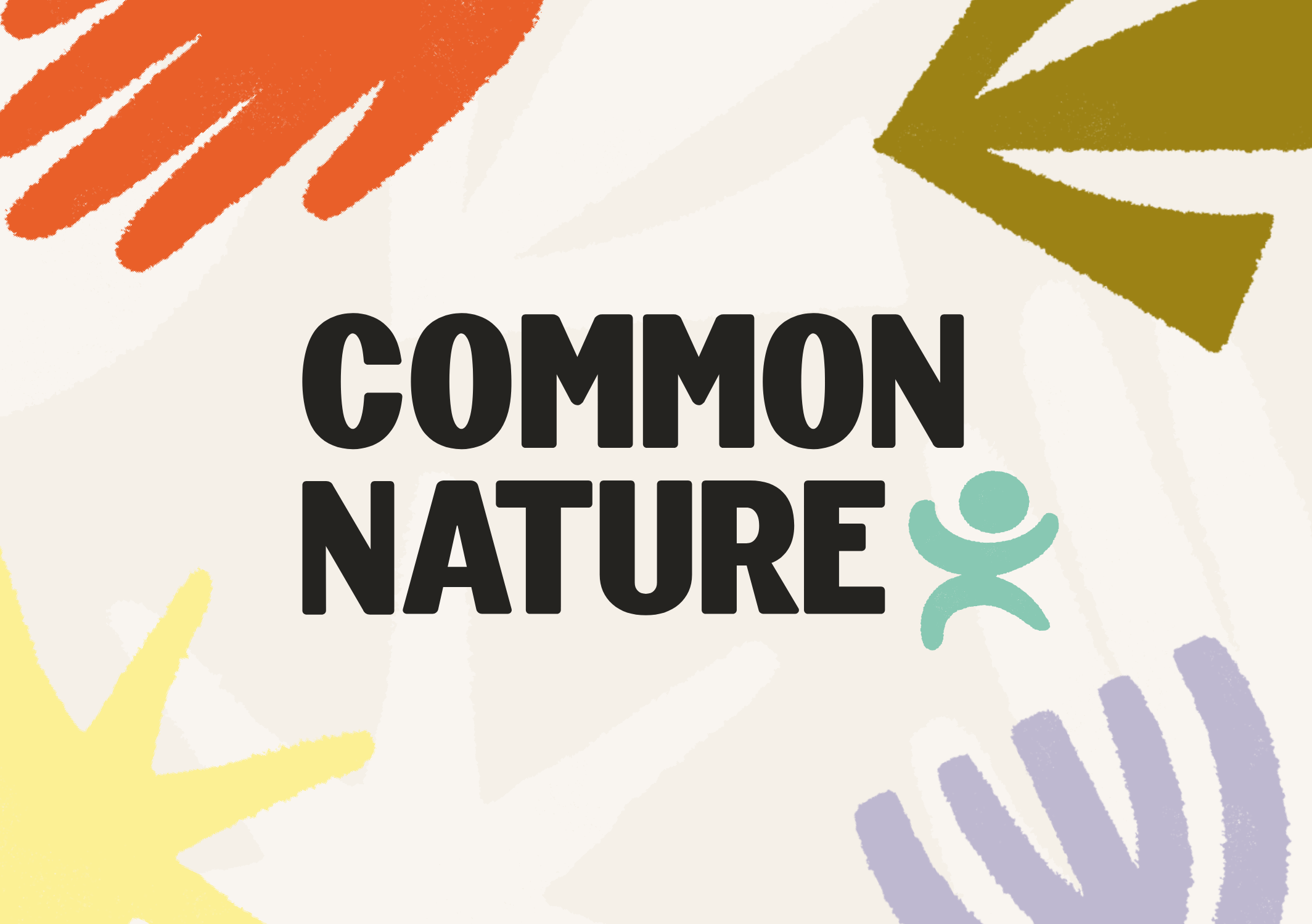
An expansive colour palette introduces vibrant pops of colour, while a playful collection of icons are used to decorate, direct and suggest.
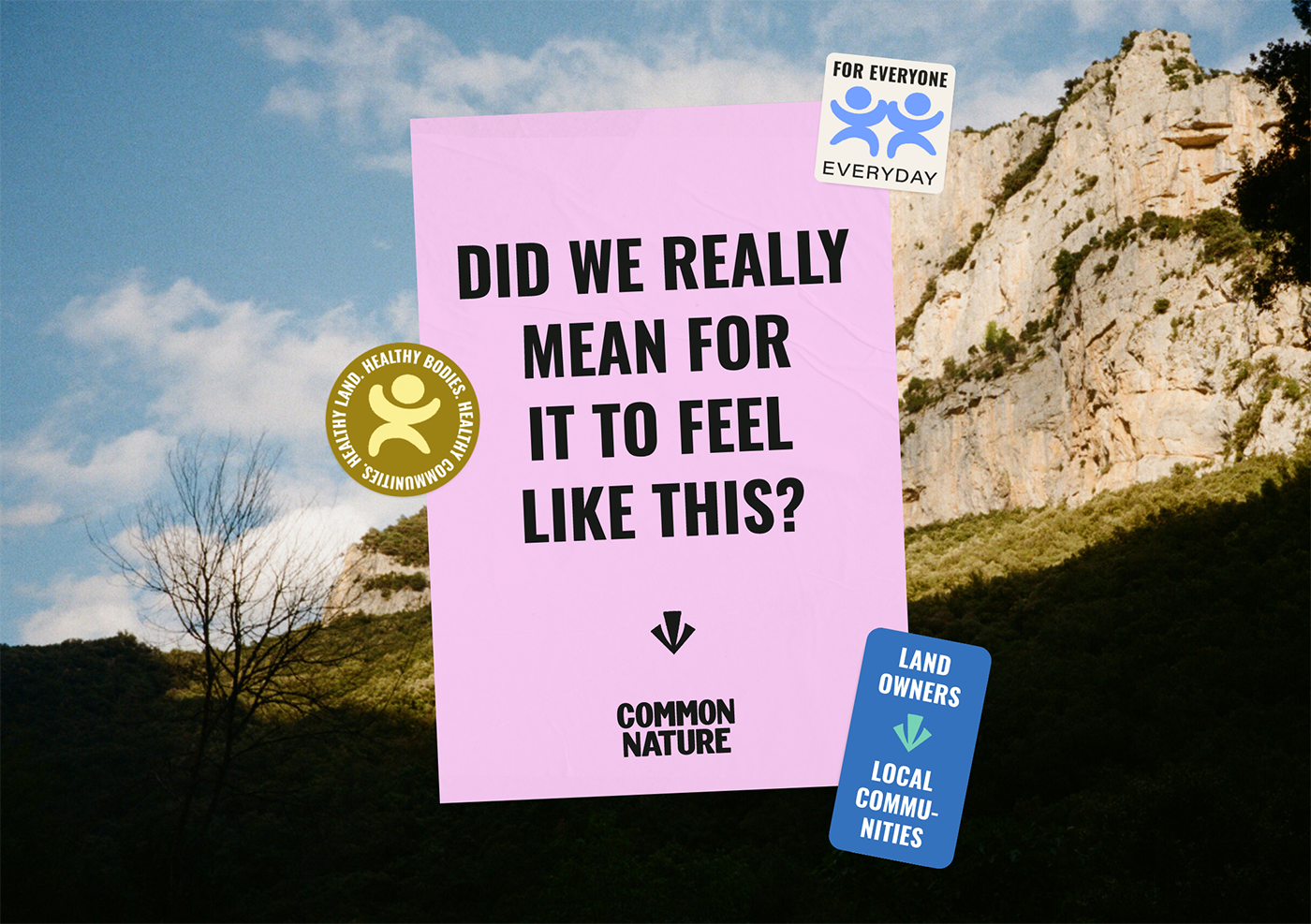
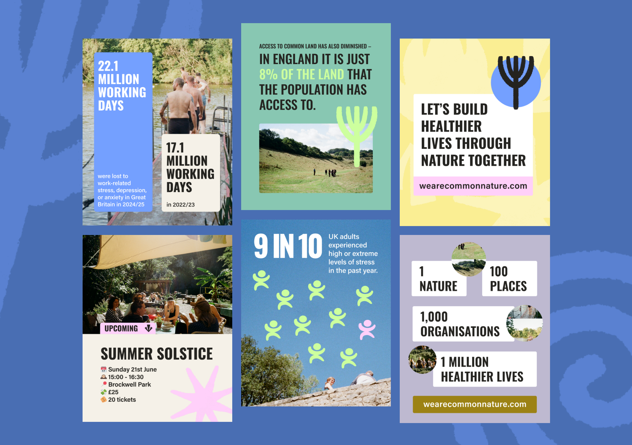
From the manifesto and posters to the website and social media, the identity brings Common Nature’s mission to life across multiple touchpoints, creating a consistent visual language with plenty of room to grow.
This is now the third project I’ve co-created with Jas, and I genuinely think she is faultless. Not only is she a fun, easy, and encouraging person to work with, but she is also profoundly gifted. I see her talent in two parts. First, the design skills you’d expect and hope for: slick, sharp, and excellent. But the second is what truly sets her apart—her ability to follow threads and weave them into a coherent and beautiful story.