Voices on the Edge is a research project based at the Academy of Music and Theatre Arts, Falmouth University, Cornwall. Dedicated to celebrating and supporting the Cornish music scene, it addresses gender inequality in music education and the industry by promoting women and gender-expansive artists and professionals working in music and sound. Through the creation of opportunities, skill-building, and community support, Voices on the Edge aims to foster a thriving network of musicians, both within Cornwall and beyond, shaping creative and viable futures.
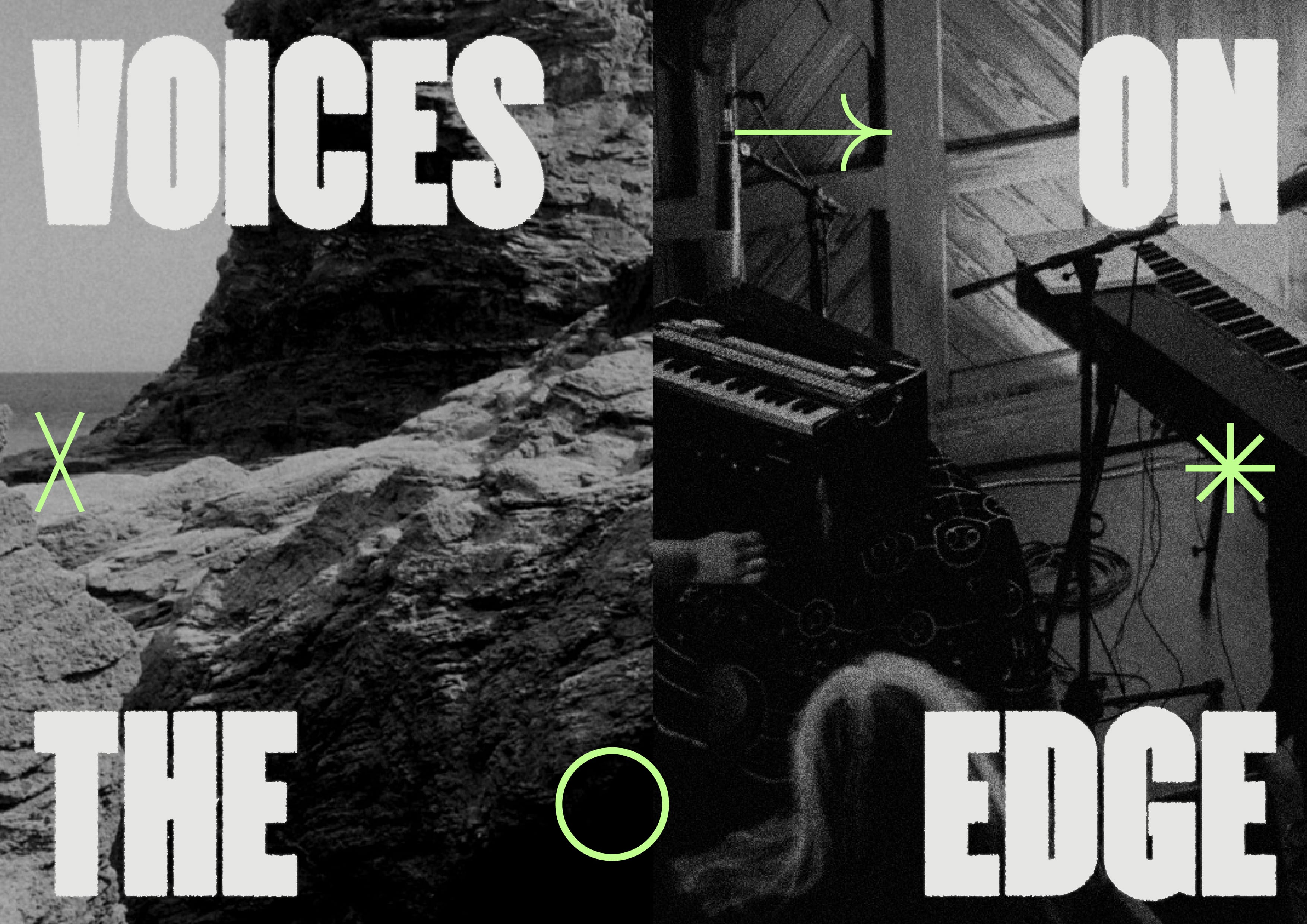
The branding for Voices on the Edge reflects the project’s bold and empowering mission. The logo features a strong, tall typeface designed to command presence on the page, symbolising the encouragement for artists to take up space. The letters have a rugged, grungy texture, referencing Cornwall’s dramatic coastline, while the placement of the word “Edge” at the outermost boundary of the design adds a playful, conceptual touch.
A sigil was developed using the phrase “I am heard,” with the letters compressed into a unique symbol that embodies the project’s core message.
The colour palette draws from both Cornish heritage and historical feminist movements, combining black and white from the Cornish flag with green and purple — the colours of the suffragettes, symbolising hope and dignity. A bold orange was added to bring energy and a contemporary edge, ensuring the palette feels vibrant and unmistakably present.
Futura, the chosen accompanying typeface, is a nod to its historical use in advertising and its later adoption by feminist artists such as Barbara Kruger, Jenny Holzer, and the Guerrilla Girls, who repurposed it to challenge cultural narratives. The Voices on the Edge logo is designed with a compressed structure to maximise impact, while its icon can be dismantled and rearranged into illustrative symbols, offering flexibility in branding across various platforms.
This identity encapsulates the strength, movement, and rebellious energy of Voices on the Edge, reinforcing its commitment to amplifying voices in the music industry.

Jas was wonderful to work with. She was incredibly attentive to our ideas and designed a brand identity that completely manifested the unseen world and intention behind our project – I’m so grateful to have worked with her.