WildKin is a brand shaped by the movement principles and philosophical foundations of Qigong. Its focus on energy, connection, and flow provided the direction for the visual identity – guiding decisions around form, symbolism, colour, and how the brand communicates across different environments. The result is a system designed to feel grounded, intentional, and alive.
A LOGO ROOTED IN MOVEMENT AND RELATIONSHIP
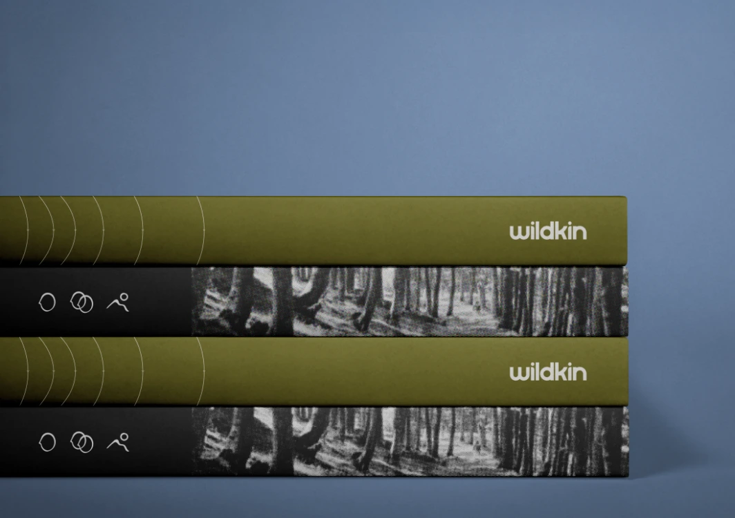
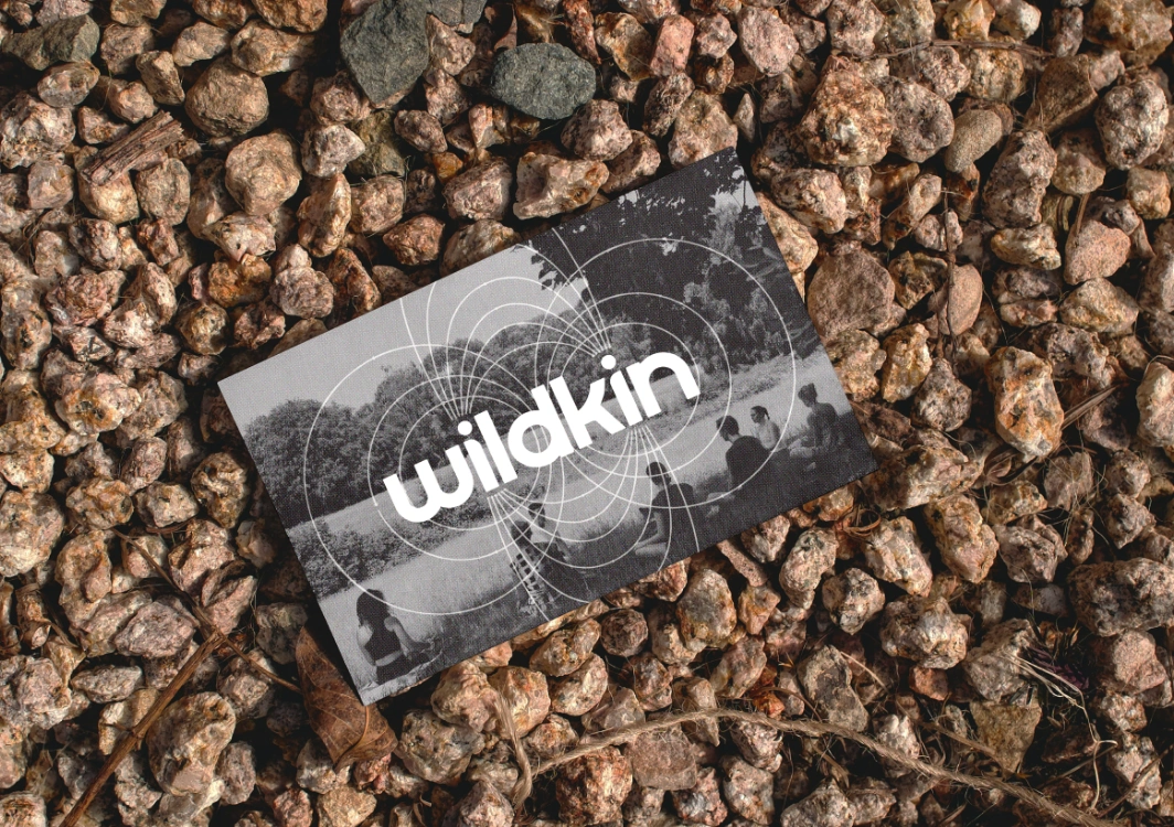
At the centre of the identity is a rounded, fluid logotype created to reflect the softness and adaptability that sit at the heart of Qigong practice. The typography is intentionally compact to ensure strong recognition across both large-scale and small-scale applications, including clothing labels and digital assets.
A defining detail sits within the two ‘i’s of “Wild” and “Kin”. Each features a dropped shoulder, creating a mirrored pair of figures subtly facing one another. This is the brand’s core message made visible: humans in relationship, exchanging energy, and meeting one another with presence. This motif is quiet but deliberate, allowing the concept of connection to sit within the brand without becoming overly literal.
COLOUR AS A PHILOSOPHY: THE FIVE ELEMENTS
The colour palette is drawn directly from the Five Element Theory in Chinese philosophy, a foundational system describing the dynamic relationships between natural forces. Each colour embodies both symbolism and behaviour:
Together, these colours create a resilient and harmonious palette that can shift in tone while maintaining cohesion. The system mirrors the continuous cycle found in Qigong practice – a movement between grounding and rising, expansion and stillness.
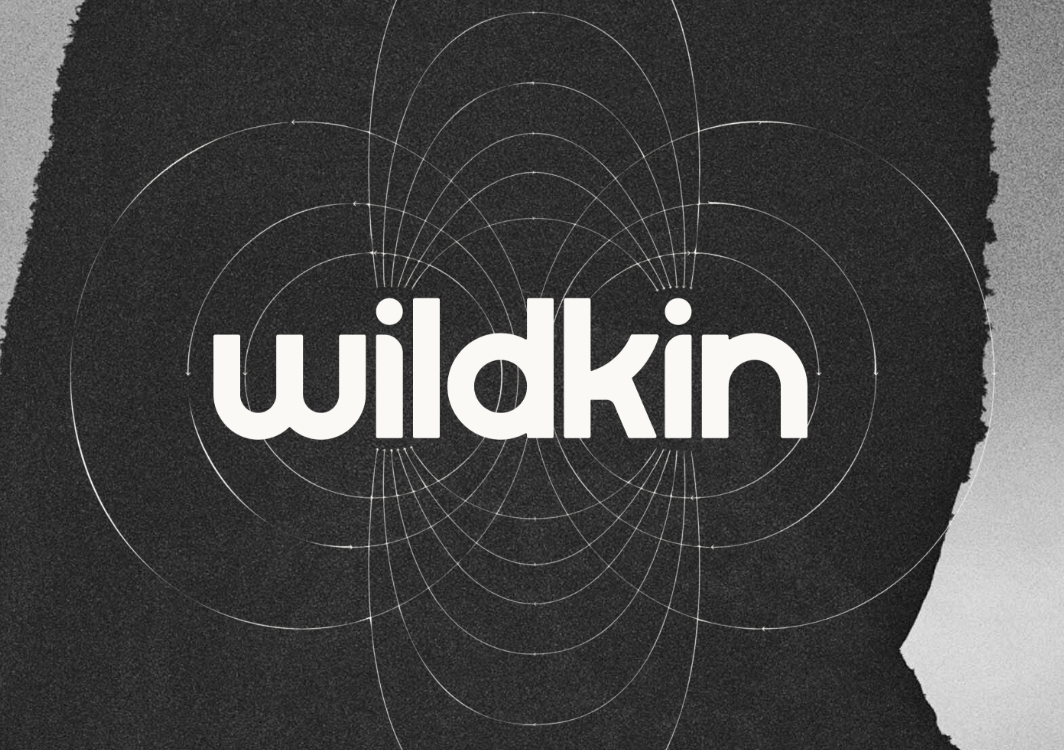
ENERGY LINES: VISUALISING EXCHANGE AND FLOW
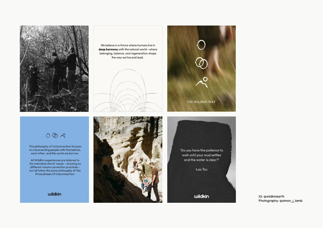
A key supporting element of the identity is the use of flowing energy lines, inspired by Qigong diagrams that map the movement of qi through the body. While abstract, their behaviour is rooted in the same principles: they bend, rise, descend, and circulate.
These lines introduce motion into static layouts and act as a connective thread across platforms. Whether used subtly in the background or prominently as a design feature, they visually express the exchange happening within oneself and between individuals, reinforcing WildKin’s values beyond the logo alone.
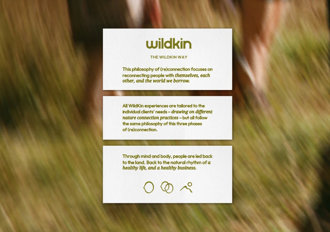
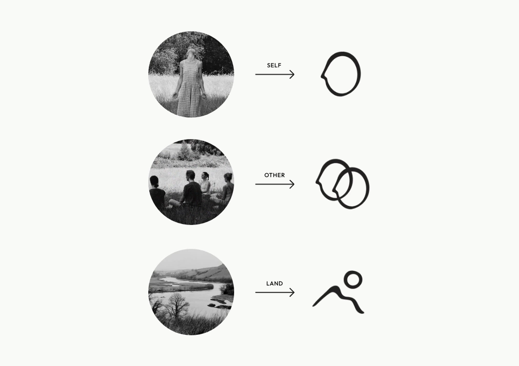
CUSTOM ICONS: SELF. OTHER. LAND.
To further articulate the brand’s themes, a set of hand-drawn icons was developed. These are intentionally simple, using organic linework that contrasts the structure of the logotype and gives the identity a more human, tactile quality.
These icons operate both as functional markers and as conceptual pieces, allowing the brand to communicate core ideas with clarity and immediacy.
A SYSTEM DESIGNED FOR FLEXIBILITY
WildKin’s visual identity is built to be adaptable. The combination of fluid typography, elemental colour, symbolic icons, and energy lines creates a system that can shift between calm, expressive, or bold depending on context, without losing its core character.
To support this, a full suite of Canva templates was created for WildKin, enabling ease of use across social media, promotional materials, and ongoing communications. This ensures the brand remains cohesive even as it evolves.
A VISUAL LANGUAGE OF BALANCE, CONNECTION AND FLOW
Every element within the WildKin identity, from the mirrored figures to the directional movement of the colour palette, is rooted in the same intention: to communicate the brand’s focus on connection, energy, and the continuous flow between people and the natural world.
The result is a visual language that feels balanced yet expressive, calm yet dynamic. A system that reflects WildKin’s ethos while offering clarity, longevity, and room to grow.
This is now the third project I’ve co-created with Jas, and I genuinely think she is faultless. Not only is she a fun, easy, and encouraging person to work with, but she is also profoundly gifted. I see her talent in two parts. First, the design skills you’d expect and hope for: slick, sharp, and excellent. But the second is what truly sets her apart—her ability to follow threads and weave them into a coherent and beautiful story. For WildKin, I offered a haze of poetic but disjointed thoughts around Daoism, Qigong, Tai Chi, nature connection, disconnection, dysregulation, loneliness, and intuition. Then I disappeared offline for a month. During that time, she wove the tapestry I could sense but couldn’t articulate. It’s a rare gift to think laterally yet move linearly. If you need a co-creator, look no further than Jas.